
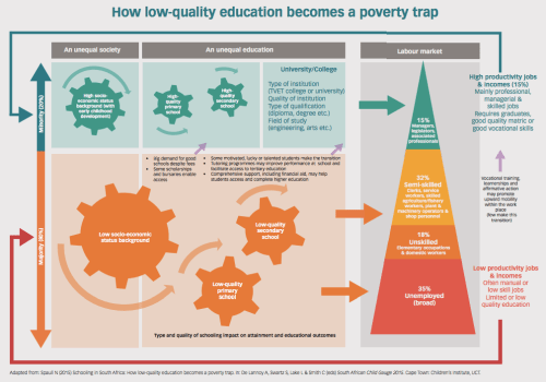
This week marks the launch of the 2015 Child Gauge with this year’s theme being “Youth and the intergenerational transmission of poverty.’ I wrote the education chapter titled Schooling in South Africa: How low-quality education becomes a poverty trap. The above flow-chart summarises the research in a single poster and shows how an unequal schooling system and an unequal labour-market perpetuate each other in South Africa such that low quality education becomes a poverty trap.
I would also recommend reading the Youth Matters bulletin. An excerpt:


It seems that the youth matters document pulled information from the Child Gauge, does that mean that the graphs they’ve generated from come from the general household survey?
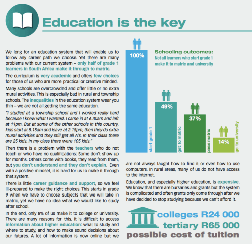
I’m trying to work out the difference between the text which states 8% “make it to college or university”, the graphic which states that 14% “go to university” (or get a university exemption?) and the participation rates for 20-24 year olds enrolled in higher education institutions (i.e. excluding colleges) which are 20% according to CHET’s most recent vital statistics. I’m guessing that there are different ways of looking at a particular age cohort’s likelihood of going to university.
CHE that is.