Below is a quick summary of what I was working on at the OECD in Paris last year. The full paper is now available online here:
- Spaull, N. (2017) Who makes it into PISA? Understanding the impact of sample eligibility using Turkey as a case study (PISA 2003- PISA 2012). OECD Education Working Papers, No. 154, OECD Publishing, Paris. DOI: http://dx.doi.org/10.1787/41d175fc-en
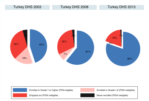
 Of the OECD countries that participate in the Programme for International Student Assessment (PISA), Turkey has one of the lowest levels of performance and the highest rates of improvement in PISA scores. However, most analyses have traditionally ignored one vital question: what percentage of 15 year olds in Turkey are eligible for the PISA sample in each wave of PISA? A new OECD Working Paper focuses on this specific question and sheds new light on the performance of Turkey between 2003 and 2012. It shows that the percentage of students that were eligible for PISA in Turkey between 2003 and 2012 nearly doubled from 36% to 68% (using OECD indicators) or from 45% to 80% (using household survey data). This is summarised in Figure 1 below which provides information from the Turkish Demographic and Health Survey (DHS) of 2003, 2009 and 2012.
Figure 1: The educational status and PISA-eligibility of 15-16 year olds in Turkey in DHS 2003, DHS 2008 and DHS 2013
While PISA aims to assess a nationally representative sample of 15 year olds, because PISA is a school-based survey, in reality it excludes all students that are no longer in school (due to drop out or non-enrolment). PISA also only samples 15 year olds if they are in Grade 7 or higher. So PISA is really a nationally representative sample of 15 year old students that are still enrolled in school and are currently in Grade 7 or higher. This might sound like a trivial technicality, and in most wealthy OECD countries like Germany or Japan it is. But some OECD countries (like Turkey and Mexico) and many partner countries (like Vietnam and Indonesia) have high levels of student dropout and delay leading to low levels of PISA sample coverage. As an aside, the new PISA-for-Development initiative aims to also survey out-of-school 15 year olds in some of the developing countries participating in that programme.
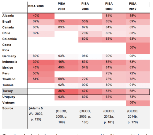
Since the beginning of PISA, the OECD has reported the percentage of 15 year olds that are actually eligible for PISA, what is called “Coverage Index 3*.” This statistic is calculated using census and enrolment data in each country and is provided in the overall PISA Reports and Technical Reports for all participating countries. For example, in Turkey in PISA 2003, only 36% of 15 year olds were eligible for PISA. That is to say that PISA 2003 in Turkey is only representative of 36% of the country’s 15 year olds. By comparison, the figure in Germany in 2003 was 93%. Table 1 below provides the Coverage Index 3 rates for a selected group of PISA countries with low levels of sample coverage (Germany and Canada are included as reference countries). From this we can see that a number of partner countries have very low levels of sample coverage, including Costa Rica, Indonesia, Peru and Vietnam, but also that some OECD countries (such as Brazil, Mexico and Turkey) have low levels of sample coverage.
Table 1: The percentage of the total 15 year old population covered by the PISA sampling frame (Coverage Index 3) in selected countries
Given these low levels of sample coverage in some countries, it is reasonable to ask: how would the results change if we included PISA-ineligible 15-year-olds in our calculations? This is the focus of a new working paper published this week, titled “Underestimating Progress and Inequality in Turkey (2003-2012): Using PISA and DHS to form a complete picture of access and quality”. The method and results are briefly summarised below.
The paper applies a new method developed by Spaull & Taylor (2015) which aims to combine statistics on the learning outcomes of 15 year olds that are still in school (using PISA) with data on the number and type of 15 year olds that are not in school (using household-survey data). By assuming that PISA-ineligible students would not have reached PISA Level 2 in Reading and Mathematics – a relatively conservative assumption – we can calculate the percentage of the total population of 15 year olds that reach Level 2 in PISA, rather than only the percentage of those that are still in school. Figure 2 and Figure 3 below provide these breakdowns for Turkey in PISA 2003 and PISA 2012 respectively, and also by gender and socioeconomic subgroups. (Note: ‘Poor40’ means the poorest 40% of 15-16 year olds, and ‘Poor40F’ means poorest 40% of 15-16 year olds that are also female).
Figure 2 Access to Literacy (Level 2) in Turkey 2003 (PISA 2003 and DHS 2003)
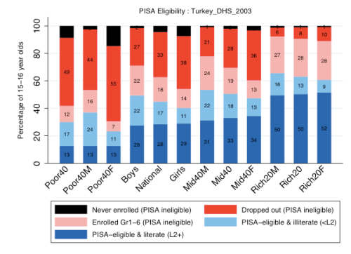
Figure 3 Access to Literacy (Level 2) in Turkey 2012 (PISA 2012 and DHS 2013)
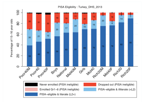
Note the results above will be different from those found in PISA reports because these results include PISA ineligible 15-16 year olds in the calculations.
The 7 main findings from the above are as follows:
- There have been significant increases in PISA sample eligibility over time from around 45% of 15-16 year olds in 2003 to 80% in 2013.
- If we account for the growth in PISA eligible 15-16 year olds, the improvement in the percentage of 15-16 year olds acquiring Level 2 is between 2 times larger (for Mathematics) and 5 times larger (in Reading) than previously thought.
- Severe delays in grade progression in Turkey have been virtually eliminated and dropout has declined by 42% over this period.
- In 2003 the richest group were twice as likely to be eligible for the PISA sample than the poorest group.
- Although both boys and girls benefitted over the period, girls benefitted the most.
- The gap in access-to-literacy and access-to-numeracy between rich and poor has not changed and is larger than previously thought.
- 15-16 year olds in the East region of Turkey are less likely to be eligible for the PISA sample than 15-16 year olds in other regions.
Whether one chooses to use the Coverage Index 3 figures reported by the OECD itself, or those calculated from various DHS surveys, the conclusion is the same: there are large and changing proportions of Turkish students that do not make it into the PISA sampling frame and this has a substantial effect on the validity of inter-country and inter-temporal comparisons. This analysis shows that the gains in Turkey between 2003 and 2012 have actually been even more impressive than if one only looked at PISA data. This method could also usefully be applied to other middle-income and developing countries with high and changing percentages of PISA-eligible 15 and 16 year olds.
References
OECD. (2016). PISA for Development: Benefits for participating countries. PISA for Development Brief (Vol. 2). Paris.
Spaull, N., and Taylor, S., (2015). Access to what? Creating a composite measure of educational quantity and educational quality for 11 African countries. Comparative Education Review. Vol. 58, No. 1.
*There is an error in the Coverage Index 3 values provided in the PISA 2003 Report. The correct Coverage Index 3 values for 2003 can be found in the PISA Technical Report for 2003. See the Working Paper for a full discussion.
 Yesterday